This Framework Delivered “Millions of Dollars”: How We Increased Sales Of A Language Learning Course by 2.6X In 183 Days
Helping growth-minded companies to
grow their online sales and
hit their revenue goals.
Our business growth thoughts have appeared in:
It’s not easy to identify the gaps in a sales page for an existing online course. But if you can do it, then you can fix the issues you find.
By doing exactly that, we grew the sales of a popular language learning course by 2.6X. This page shows you exactly how we did that.
WARNING: This page is long and super detailed, because I wanted to show you exactly how we achieve the sales growth. So in case you prefer watching to reading, here’s a video walkthrough of this entire page, for you too:
I guarantee, if you apply this method it can make you millions of new dollars in sales and revenue (see the video below, for proof).
Now, I’m not able to mention the time period these new sales were made over (per day, per week etc).
But the actual A/B test ran over a long enough period of time to confim this growth was legit (statistically significant in technical terms).
Our changes were also rolled out across multiple products and funnels for StoryLearning.com.
In this interview, the CEO, Olly Richards, says the impact of the work, in dollar value, will be –
“in the millions, beyond a doubt”:
However, more than the dollar value, it’s important to note the 160% revenue growth here. This can help you to see the potential value of this work when applied to your company at your revenue level.
This type of growth percentage is typical for work of this nature.
The subsequent growth in equity and enterprise value runs into the millions of dollars here. It can be easily calculated with an EBIDTA/discounted future cash flow analysis.

Now, I understand if you’re skeptical.
But read on until the confession (spoiler: we didn’t get this right on the first attempt). However, the end result is legit and you can see how, below.
The results of this work mean you can now:
- Profitably outspend the competition with your ads
- Generate more sales with the same budget
- Increase overall profit by far more than 2.6X (because the company’s fixed costs did not increase)
- Increase company sales, revenue and long term equity value
In this post, you’ll see exactly how we did this.
Want to see another case study where we increased monthly sales by $131,217? Just email:
ss AT topgrowthexperts.com and we’ll send it to you.
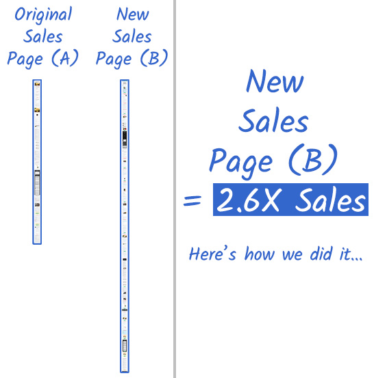
Table Of Contents
The Problem With Existing Sales Pages
Well Built Sales Pages
The Original Sales Page (A)
The Original Sales Page (A) Framework
So What Actually Goes On A Sales Page?
The Solution: The Smooth Sales Page Ratio Framework
The New Sales Page (B)
The New Sales Page (B) Framework
Here Are Both Pages Side By Side:
Here Are Both Sales Frameworks Side By Side:
There’s Plenty More Going On Here Too…
A Confession: This Took A Few Attempts
Repositioning & Branding The Core Concept
Wrapping Up
Need To Grow Your Online Sales & Revenue?
The Truth About Sales Pages
A sales page is a sales process, in written form.
The job of a sales processes is to communicate an understanding in the buyers mind, related to the product they’re interested in.
The idea is to:
- Clarify where they are now (A)
- Solidify where they want to be (B)
- Get them to acknowledge that they can’t close the gap in the middle by themselves
The rule of bridges then introduces your product as the bridge that will take your prospect from A to B.
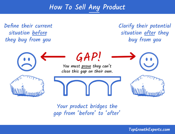
If you do that correctly, the prospect will have a good understanding of the product and why they should buy it now.
They will also have a much smoother sales experience, and will be far more likely to buy.
This is the effect of a well built sales process.
The Problem With Existing Sales Pages
Most sales pages have an internal focus. Whether they’re built by a founder or an internal department, they usually put out why their product and their company is so great.
You can catch these pages in action because they use the words ‘we’, ‘me’, ‘us’ and ‘I’, a lot.
Now, if you’re writing an ‘about us’ page or a case study or something that is obviously about you and your activities, then that is fine.
But on a sales page, these words are dangerous.
Well Built Sales Pages
A solid sales page needs you to understand the person you are selling to and their needs.
As I said, they are standing in location A and want to get to location B. Your product is the bridge that will take them from where they are to where they want to go.
To sell any product, you need to show that you understand this.
You also need to know how to build trust so that the prospect knows that you can help them.
You do this by answering the right questions in the right order. It’s the basis of building a connection with a reader. But most people don’t know how to do it in sales, both offline and online.
Think about it like an in person, face to face conversation. You can’t effectively build a connection with someone by talking about yourself all the time or answering whatever question you want in any order you choose.
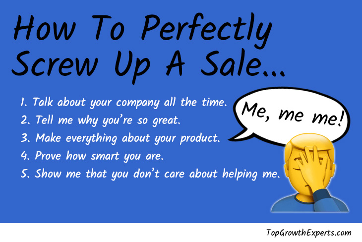
Yet take a look around for yourself. You’ll see that this is how many companies try and sell products online, even today.
Fortunately, it this ‘all about me’ effect wasn’t too bad with the client in this example.
But you can see why it happens – it isn’t the fault of the company. That’s because as the company/product creator, you are very product focussed by default.
So when it comes to selling the product, it makes sense that you continue talking with an inward focus. But when selling something, that is not the best way to move a prospect to a buyer.
Did you know: The word ‘you’ is so powerful and instantly connects with people. That’s why Facebook have banned the use of it on their advertising platform. So you won’t see the word ‘you’ in any ads that run on Facebook.
If it’s such a powerful word, do you think we should be using it more often to sell products to people through the written word? Definitely. But many companies miss this trick.
Want to see another case study where we increased monthly sales by $131,217? Just email:
ss AT topgrowthexperts.com and we’ll send it to you.
The Original Sales Page (A)
The page we were working to improve belonged to international language learning company, IWillTeachYouALanguange. The existing traffic came from a nice blend of organic and cold paid traffic.
We were tasked with increasing sales for their Spanish language learning course.
Here’s the sales page before we rebuilt it (warning – these are long form sales pages).
On the right hand side, you’ll see some blue written notes about what is contained in each section of this original sales page and what questions are being answered:

The Original Sales Page (A) Framework
Let’s take a closer look at those sections and how they’re being delivered to the prospect. You can see the framework for the original sales page looks like this:

You can see how the order of this original sales page is not very smooth.
It won’t connect with the prospect fully. That’s because it doesn’t work with how they might ask questions in order to be influenced to buy this product.
For example:
- Step 3 talks about the author’s pain points from their point of view (it’s all about them)
- Step 5 introduces the product
- Later, step 12 talks about what the author wants as an outcome for the prospect
- Then again at step 15, they go back to talking more about the product and the outcomes
The overall framework is a little disconnected.
If it was a road, it would be very bumpy.
It moves around too much to provide that smooth sales experience we need. So it wont fully be able to connect with a prospect and make them feel at ease, so that they buy the product.
So What Actually Goes On A Sales Page?
You may have come across lots of formulas and methods for how to build a sales page. Sure, a good sales page is like a good movie – long enough to cover the important bits, but short enough to keep it interesting.
And it’s all very well to know the ‘Star, Story, Solution’ method or the ‘Attention, Interest, Desire, Action (AIDA) model.
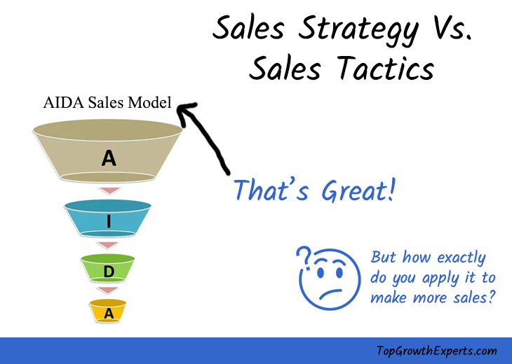
Yes, this is a clever sounding, neat and tidy strategic overview. But what does this mean tactically?
Let’s go back to our earlier example.
You need to fully understand the prospect and their needs, and understand:
- What level of awareness is the prospect at when they first come to your sales page?
- What is their present situation?
- What is the end result they want?
- How does your product act as the bridge that will take them from their present situation, to the end result they want?
Your sales page needs to show (and not tell) the prospect that you understand this.
Want to see another case study where we increased monthly sales by $131,217? Just email:
ss AT topgrowthexperts.com and we’ll send it to you.
The Solution: The Smooth Sales Page Ratio Framework
If you’ve ever tried to build a well built, high performance sales page, you know it’s not easy.
You may find it useful to know the following page ratios. You’ll also see the questions you need to answer (from the prospect’s viewpoint).
You’ll also see the overlaying sales framework, to help you:

The Top 10% of The Page (Hook)
The top 10% of the page is about matching the prospect’s awareness level, meeting them there and then moving them forward from there.

You will also need to explain what is new about your product and why it is different to other available options out there.
Doing this precisely will release the perfect level of dopamine into the prospect’s brain. That is important because research and evolution shows how the human brain is naturally wired for novelty, and that attracts attention.
For example, here’s how we added novelty to our new sales page (B) below:
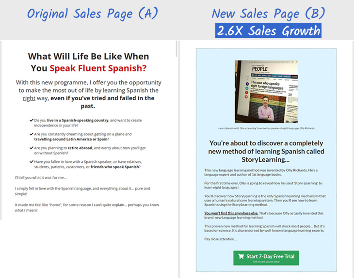
If you do this right, your page will make your prospect feel curious. All of a sudden, your page will become irresistible to your prospect.
Not many people know the details like this, but it’s how you build a hook into your page, on purpose.
That’s how you get your prospect’s interest quickly and it encourages them to read the rest of the page.
This can change depending on where you’ve sent them to the page from.
For example, if most people arrive from a natural organic search engine listing, you may use a different (possibly dynamic) message based around their search term.
However, if you’ve sent them to your sales page from an ad, you will need to match the page message to the message in the ad. It’s amazing how many people get this wrong.

Just aligning this issue alone can increase sales greatly – it is a huge friction point where the degrading effect on sales is often overlooked and truly under-appreciated.
The Next 40% of The Page
The next 40% of the page is about using emotion. At the same time you have to tell your story in a way that answers a specific set of questions in your prospect’s mind.

This will strike a chord in the mind of your prospect. That’s because you’re answering questions and objections they have already.
This will hold their interest and persuade them to read the remainder of your page.
The Remaining 50% of The Page
The remaining 50% of the page is where you finish off your emotional story and switch to logic mode.
This is the point where you will tell your prospect how your product works in real terms. So this is the mechanics of how your product allows the prospect to achieve the end result they want.

Then once you’ve delivered on how your product gets results, you will transition over to making them an offer that they can take right now.
It’s is very important that this is not just any old lukewarm offer. It has to be a solid and unreal offer where it is harder for them to say no instead of yes (I will discuss this more in detail in a future post).
This leads us to answering the following questions in this specific order, so that it relates to the prospect:
- Is it for me and how is this new?
- What do I get from this product?
- What are the product’s weaknesses?
- What is stopping me from success?
- Who is to blame for my failure?
- How was the solution found?
- Can you be trusted?
- How does it work?
- How do I get involved?
- What happens if I don’t start now?
It’s important to remember, this is not a strict framework that acts like a checklist.
Sometimes sales pages only need to generate a free opt-in. Other times they need to sell a sales call/demo of a product. And some pages needs to sell language learning courses for hundreds of dollars in a single up front payment.
So the amount of selling that needs to be done will be balanced out with the detail you need to get into.
You can also deliver your answers to those questions across multiple online pages, or a mixture of online channels then transferred to a live sales person, for example if selling a high ticket item like a B2B consulting service or a car.
The usage situations are very dynamic. You’ll see this below, when we show you the new sales page we built for this example.
So be careful not to use the above list like a strict robot.
Want to see another case study where we increased monthly sales by $131,217? Just email:
ss AT topgrowthexperts.com and we’ll send it to you.
The New Sales Page (B)
So with the smooth sales page framework in mind, we set to work to rebuild the page.
Here’s the new long form sales page after we rebuilt it. It actually increased in length because this page has to do some heavy lifting, and generate an up front cash sale of nearly $300 (see additional transparency message, under the image).
Once again, you’ll see our blue written notes on the right hand side. They’ll tell you what is contained in each section of this new sales page and the questions being answered:

[For full transparency: this is an updated version of the actual page we created. The page shown above offers a 7 day free trial which wasn’t part of our new sales page – that was a later test we ran, but we couldn’t get the exact copy of the new sales page B in time and had to pull it from an archive, but the example above was very close].
The New Sales Page (B) Framework
Let’s take a closer look at those sections in the new sales page, and how they’re being delivered to the prospect. You can see the framework for this new sales page looks like this:

This time, the order of the sections takes the prospect through a very different way of thinking.
It’s much more aligned to how they may ask questions when deciding to make a purchase, thanks to our smooth sales page framework.
This new sales page hooks the prospect into reading the page with a new process for learning, then gives them a summary of what they will see.
Then it continues with explaining the new learning process that will get them to where they want to be. It also explains other relevant details to them, like what has been holding them back so far, which helps to clarify where they are now.
Finally, it smoothly positions the product as the bridge that will take them from where they are now to where they want to be.
Throughout the page are also various trust building elements like testimonials and places in the media where the author has been mentioned or has spoken.
The entire page nicely aligns with questions and objections the prospect may have. Then it answers them in a way that makes sense.
Our research process helps us to understand the prospect first, so that we can build pages like this.
Want to see another case study where we increased monthly sales by $131,217? Just email:
ss AT topgrowthexperts.com and we’ll send it to you.
Here Are Both Pages Side By Side:
Here is what the original sales page (A) looks like directly next to the new sales page (B):

Want to see another case study where we increased monthly sales by $131,217? Just email:
ss AT topgrowthexperts.com and we’ll send it to you.
Here Are Both Sales Frameworks Side By Side:
Here is what the original sales framework looks like directly next to the new smooth sales page ratio framework. You can see how having a solid framework to start with allows us build a really strong sales page that we can then elaborate around.
I’ll talk about some of these ‘elaborations’ (is that word!?) in just a moment, but here are those two frameworks next to each other:

There’s Plenty More Going On Here Too…
Although the smooth sales page ratio framework helped us to get started, there was much more that we had to do. It’s tough to fit everything in this case study, but here are a few examples.
Page Intro
It’s important to get a strong start to a sales page.
It has to jump out for new prospects and returning prospects. You can see the original page has a logo at the top of the page. While this looks nice, it doesn’t do much persuasion or selling.
From looking at site analytics and the buying patterns, we knew that many people came back to the site to buy.
So we presented them with a buy now button at the very top of the page. Recordings of site users showed this button led to purchases enough times that it is still live on the site today.

Another thing we did is to build some credibility in right away. You can see the logos of high profile places where the author has spoken and where his language learning courses have been mentioned. This provides a strong boost in credibility for the product, to all prospects.
Compare this to what was in this space before – a simple logo. This didn’t do anything to build up or sell the product.
So you can already see the start of the difference in persuasion strengths, of both pages.
Page Headline
Another common problem we see is using vague copy. You should be using specific copy where you can. This is tough because of the false belief that you will eliminate part of your audience by being too specific.
But the actual effect is that you strike a harder chord with your messaging and really grab your prospect’s attention. This is a balance but when it isn’t done, the copy is loose and that doesn’t work for anyone.

You can see above, how we turned an overly vague headline into one that generates interest (speaks 8 languages), initiates curiosity with the speed aspect (learn Spanish fast) and then piles on more curiosity whilst triggering dopamine in the prospect’s brain, with the mention of the new concept (StoryLearning).
Product Imagery
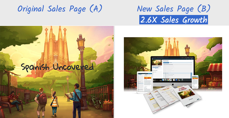
If you can show people a picture, you wont have to paint it in their minds.
So on that basis, it’s always nice if you can give people an idea of what they’re buying. This applies even more to digital products, because they don’t actually exist in tangible form.
Back in the day, we used to create product box shots for downloadable products, and it always helped with increasing sales. The human brain just likes to see something that looks like you can pick it up and hold it, because we place value in tangible goods.
This is the same reason they make you use chips in a casino instead of cash.
You associate value with paper money so you’re less likely to spend it. But if you turn that into chips, they act like worthless gaming tokens that you are more ready to spend. However, you can still hold casino chips as a tangible item, so this keeps you much more engaged as a game player instead of using any form of digital cash etc.
Want to see another case study where we increased monthly sales by $131,217? Just email:
ss AT topgrowthexperts.com and we’ll send it to you.
A Confession: This Took A Few Attempts
The first time we had an attempt at this page, it sold around the same level as the previous page. Womp :/
But, with this many moving parts, there can be some friction points that are missed. Big gains come from rolling your sleeves up, doing the groundwork and further research.
So, going through more buyer data and surveys from the new page, we found that a section of the page was missing.
People needed to see more details of the product and what they would experience when they bought. They were left questioning this, which is a big no no.
So we had to bring in more details of how the product contents were was laid out and how the course could be consumed. Then we could future pace the prospect to get them to imagine using the product.
That is how this new friction point was overcome, and you can see the end result on the new sales page (B) above.
Repositioning & Branding The Core Concept
Another thing we did was to re-position and brand the core concept of the original product.
This is some super deep and complex material, but as an overview, the original problem was that ‘learning through stories’ was too vague and not very strong.
It’s also important to have a unique/new angle to products you sell, as this is very valuable. Alongside that, there needs to be a single point of belief around why your product works better than any others out there.
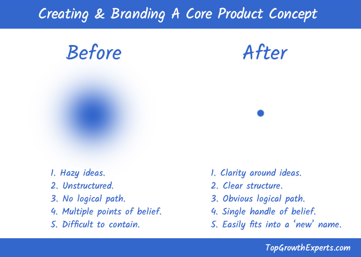
98% of products in the market miss this important aspect of sales, which is why they end up competing with others (you don’t want to compete with anyone, you want to be positioned as the clear best winning product out there).
So although a unique mechanism for learning Spanish did exist in this course (learning through stories), it wasn’t really being built into anything specific and unique by name.
It’s a bit like the above example with the product image. There was no real solid handle on this unique mechanism, and that is a big problem.
So we ended up re-positioning the old line of ‘learning through stories’ and turning it into a unique brand called StoryLearning.
We made sure to intro this as a new concept in the language learning arena, which hooked in the prospect to read the rest of the page, like this:

This concept was really liked by the company. They ended up registering the concept as a trademark and even spent a nice chunk of change to acquire StoryLearning.com.
They’re essentially now renaming the company and will work under this brand now – a move that will add millions of dollars in tangible value to their company, as the owners of an original and unique concept.
Want to see another case study where we increased monthly sales by $131,217? Just email:
ss AT topgrowthexperts.com and we’ll send it to you.
Wrapping Up
So I hope you can see the work that went into creating this sales growth of 2.6X.
There were a few more off page elements that we worked on too, but I will cover this in another post.
There are also some aspects of the new sales page (B) that can be improved. Things like the design of the page can be worked on and made fresher, but for this project, we stuck with the original design and worked on increasing sales performance.
With the 2.6X response, everyone was happy and this project was considered a big success.
I hope you can take some of this information and apply it to increase the sales and revenue of your pages too.
Just remember, this is a mix of part science, experience and art so be careful how you apply it. The checklist is not a strict rule for all pages, and if used too directly, can bloat a page.
I’ll talk about how to navigate some of these finer points in a future post too. But there is enough information here for you to apply these success frameworks to literally grow online sales and revenue of your own.
Need To Grow Your Online Sales & Revenue?
If you want us to write (or rewrite) a sales page like this for you, email us on ss AT topgrowthexperts.com.
We can help with all aspects of sales and marketing across the entire buyer and customer journey to make sure you’re maximizing your sales and revenue.
So reach out today on ss AT topgrowthexperts.com or you start with a free marketing plan.
I guarantee you will learn things about your sales growth, that you had never considered before.
Want to see another case study where we increased monthly sales by $131,217? Just email:
ss AT topgrowthexperts.com and we’ll send it to you.

